20

I'm pretty embarrassed to admit I don't know this one...I just realized I've always just described it, not actually named it :)

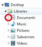
So, that folder/directory collapse/expand symbol thingy, you know, this one:

Screenshot containing symbol in question

What is it called?

Some file managers depict it as a plus/minus sign, others as a triangle with changing orientation and/or color, and other file managers have yet different symbols for it.

But I'm looking for the generic name of the functionality.

My Google searches have so far all resulted in "plus/minus symbol" or "folder tree triangle" or similar, all referring to the specific icon or symbol used to represent the functionality (and, as usual, using the terms "folders" and "directories" interchangeably).

But there just has to be a proper name for it!

Judith
  • 673
  • 4
  • 18
Rody Oldenhuis
  • 464
  • 1
  • 4
  • 14
  • 1
    It's a tree view widget known as an expander arrow. – martineau Aug 29 '13 at 10:36
  • @martineau: is that true also for the "old fashioned" plus/minus signs? – Rody Oldenhuis Aug 29 '13 at 11:12
  • 2
    I suppose a more generic term would be an expander control or indicator, neither of which exactly roll off the tongue. – martineau Aug 29 '13 at 15:00
  • This answer is obviously incorrect, so I'm posting it as a comment - but in almost all software I've used, it's known as a *caret*. – dgo Jul 01 '14 at 23:46
  • @user1167442: caret is the name of the ">" symbol. When you click on it, they often replace that with a chevron (too lazy to look up the Ascii code to include it here, but it's the caret rotated so it points down). But that's the symbol they sometimes use for the function, not the name of the function, itself. – fixer1234 Jun 15 '16 at 19:01
  • ▶ ([`Black right-pointing triangle`](https://codepoints.net/U+25B6)) ▼ ([`Black down-pointing triangle`](https://codepoints.net/U+25BC)) – ashleedawg May 18 '22 at 15:44

5 Answers5

18

The Microsoft UX Guide mentions these UI elements in the section about Progressive Disclosure Controls.

The element shown in your screenshot is amazingly named rotating triangle. Their counterparts are named plus and minus controls:

enter image description here

Both elements are also discussed in more detail on later pages, but the name is always the same.

enter image description here

The name of another UI element that is often associated with collapsible containers is the chevron, which is also pictured in the first screenshot. But this element is used in a different context.

Bob Stein
  • 1,383
  • 1
  • 16
  • 23
Oliver Salzburg
  • 86,445
  • 63
  • 260
  • 306
  • "Progressive Disclosure Control" is a great term for this [UX concept](https://ux.stackexchange.com/q/28050/25643). Good thing you captured that excellent table from the Microsoft article, where it's now [kind of busted](https://docs.microsoft.com/en-us/windows/win32/uxguide/ctrl-progressive-disclosure-controls#progressive-disclosure-controls-1). That article now links to [current design guidance](https://docs.microsoft.com/en-us/windows/uwp/design/) called UWP. In familiar Microsoft cruelty it only links to the top. I can find no mention within UWP of Progressive DIsclosure Controls. Pity. – Bob Stein Mar 12 '21 at 14:34
4

Generic term is "disclosure widget". Third parties will of course use their own variations though.

https://en.wikipedia.org/wiki/Disclosure_widget

A disclosure widget, expander, or disclosure triangle is a graphical control element that is used to show or hide a collection of "child" widgets in a specific area of the interface. The widget hides non-essential settings or information and thus makes the dialog less cluttered.

The disclosure widget may be expanded or collapsed by the user; when this occurs, the containing window may be expanded to accommodate the increased space requirement. The state of the widget is often signified by a label with a triangle next to it, pointing sideways when it is collapsed and downward when it is expanded (corresponding to the widget's current state), or a button with an arrow pointing downward when it is collapsed and upward when it is expanded (corresponding to how the widget will change state if the button is clicked). Some disclosure widgets can appear as a plus button when collapsed and a minus button when expanded.

In some implementations, the widget may be able to remember its state between invocations; this may increase user familiarity with the interface. In other implementations, the widget may disappear when clicked in order to make room for the newly revealed controls; this state is not remembered.

JoeDuncan
  • 141
  • 1
  • 1
    Please quote the essential parts of the answer from the reference link(s), as the answer can become invalid if the linked page(s) change. – DavidPostill Jun 15 '16 at 20:36
1

Back in the Lotus Notes days, these were known as twisties. I vote we bring back that name. https://www-03.ibm.com/support/techdocs/atsmastr.nsf/Web/TwHelp

IanG
  • 11
  • 1
1

Technically spoken, this symbol is a button to collapse/expand the TreeViewControl. Microsoft not provided any collapsible control for Windows applications, if we required Collapsible control we have to develop our own control with our own functionality.

So I would say the most generic name of this control is "Collapsible Control" :)

Leo Chapiro
  • 15,459
  • 5
  • 42
  • 45
1

I call the icons the expand icon and the collapse icon, and the control with which the icons are associated the expand/collapse control. I'm not aware of a standard cross-platform name for it, although duDE's Microsoft-based answer seems entirely reasonable.

user340406
  • 11
  • 2