2

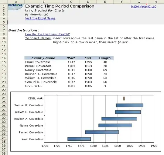
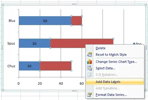
Is it possible to place the labels not on the Y axis, but on the data point itself in a stacked bar chart in excel?

I am trying to modify the timeline template available here so that my labels for each bar appear over or next to the bar rather than all the way on the left side.

See the image below for how it looks now.

timeline

warren
  • 9,920
  • 23
  • 86
  • 147
  • http://superuser.com/questions/194041/excel-scatter-chart-with-labels/194756#194756 points to a similar issue, but for XY plots in specific – warren Oct 06 '10 at 01:10

2 Answers2

3

In playing with Excel, it looks like you can right-click on the dataset and select "Add Data Label." I'm not sure how to replicate what you have exactly. Like so

Chris
  • 1,092
  • 2
  • 11
  • 15
  • wow. Thanks Chris. /me goes and hangs head in the corner for not seeing the right-click option! – warren Oct 06 '10 at 17:34
  • I'd still like to be able to put the *names* on the bars, in addition to the data labels, but this is a good start :) – warren Oct 06 '10 at 22:25
  • 1
    Once you've added the data labels, you can edit them manually. I'm playing with Excel now, if I can figure how to do it automatically, I'll let you know. – Chris Oct 07 '10 at 12:26
  • this *is* very close to what I'm looking for, and is a great start towards my final goal :) – warren Oct 13 '10 at 15:00
1

Check out XY Chart Labeler. It's an excel add-in and contrary to it's name, it supports many chart types.

Don't thank me, User Toc posted this answer in the question you referenced.

DaveParillo
  • 14,505
  • 1
  • 39
  • 46
  • I saw "XY Chart Labeler" from that other question ... even referenced it in the comment I left on the question :) ..however, it *seems* to only support scatter plots (from what I read about it) – warren Oct 06 '10 at 17:32
  • 1
    It will do bars & columns, but Chris's answer is still better! – DaveParillo Oct 11 '10 at 18:19